TYPOGRAPHY | TITLE CARD DESIGN | MOTION GRAPHICS
ILLUSTRATOR | AFTER EFFECTS | PHOTOSHOP
PATH TO PARIS
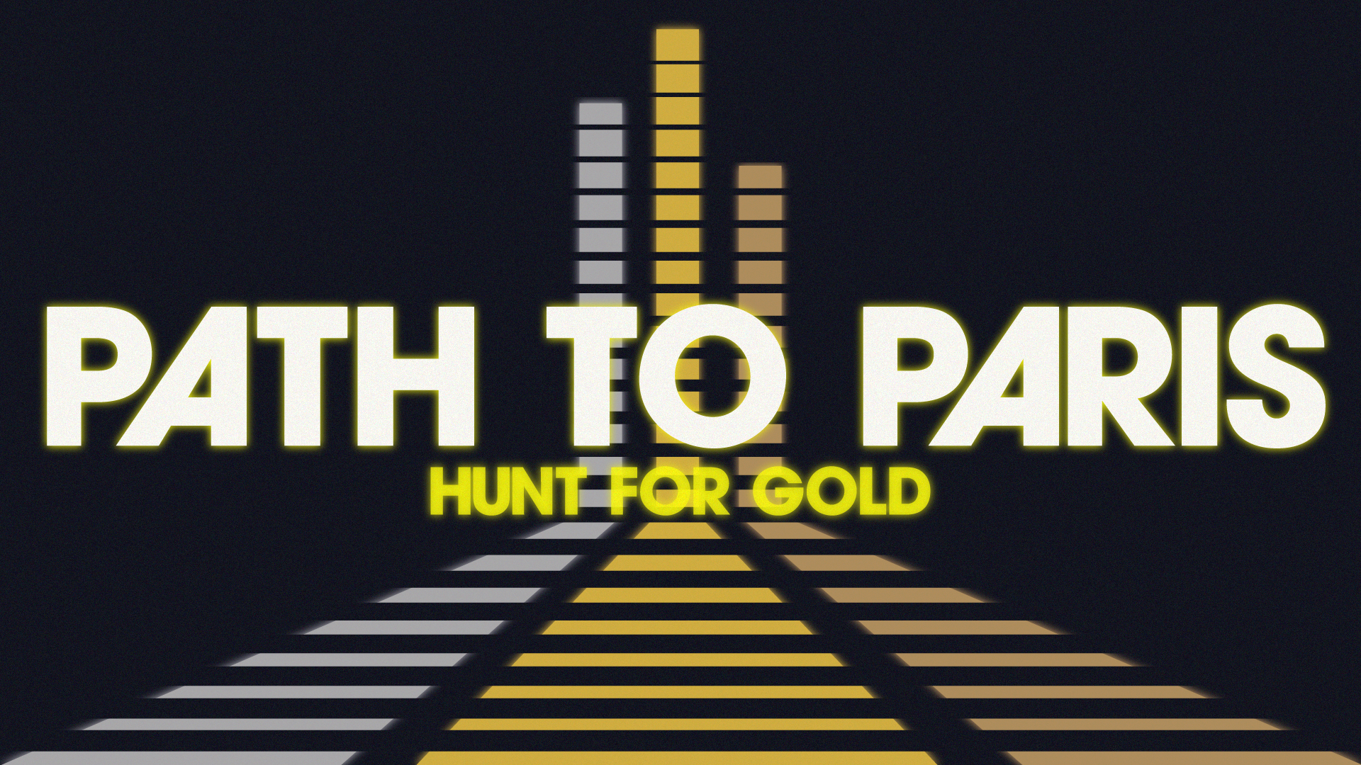
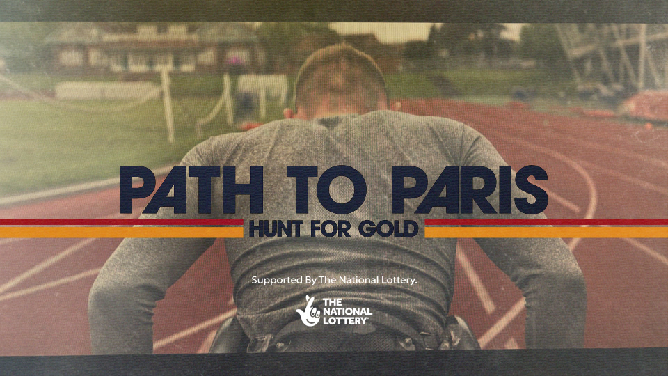
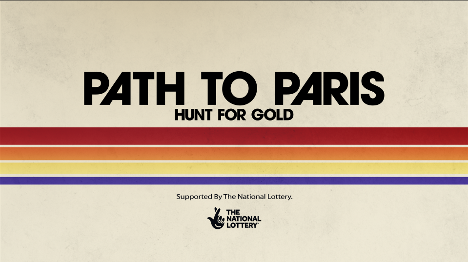
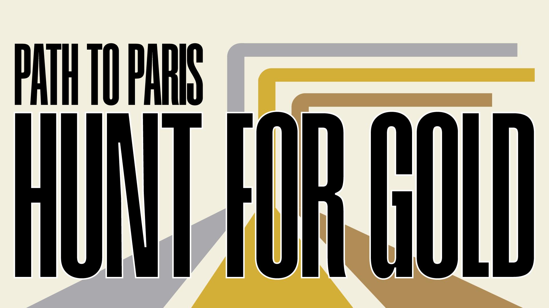
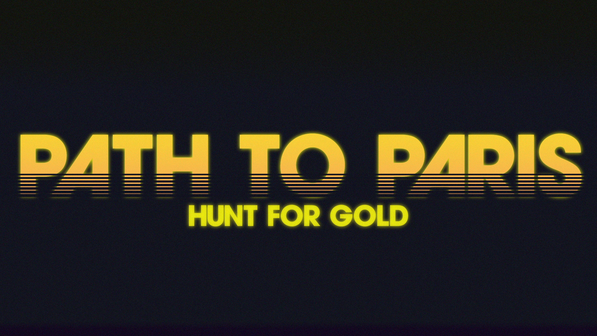
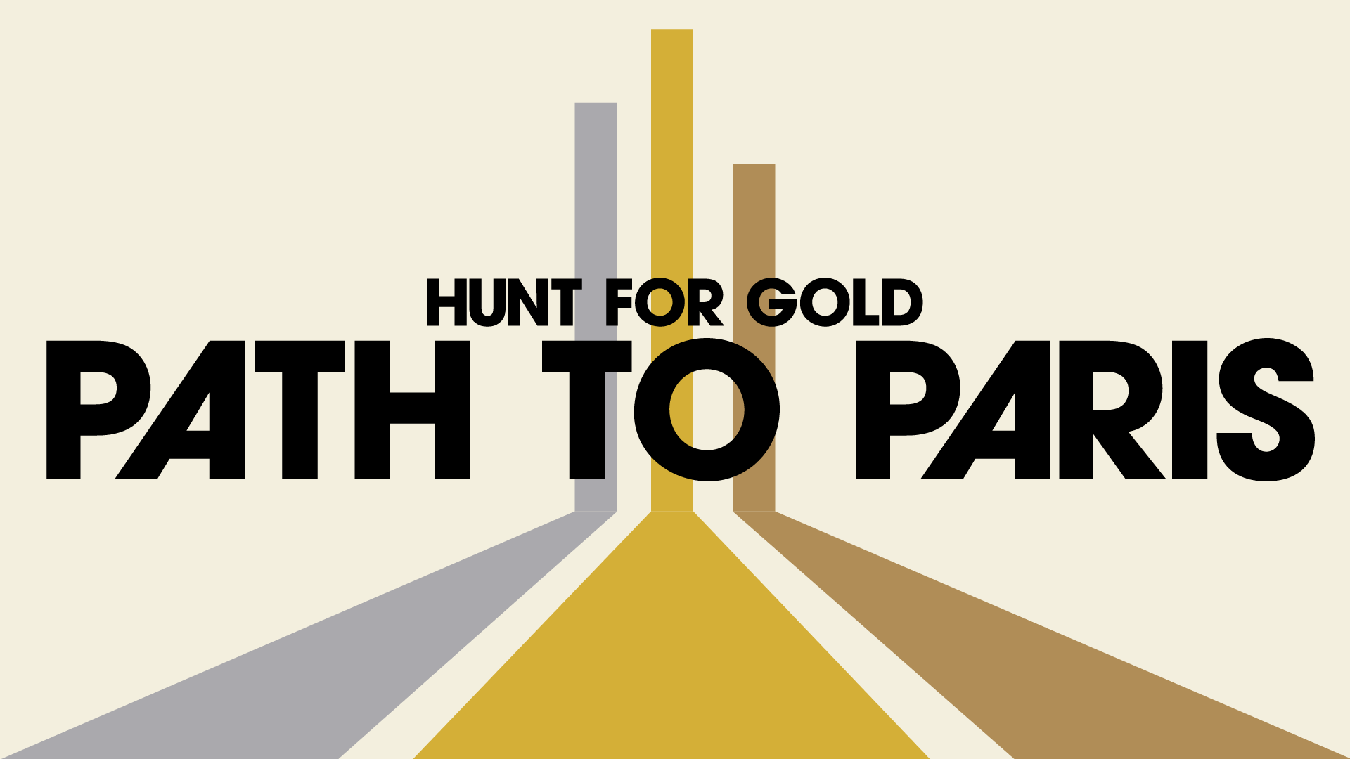
Channel 4 sought to capture the glory days of 80s track and field for the title cards of their two-part documentary series Path To Paris, following Team GB olympians on their journey to the games.
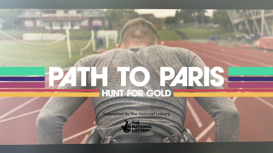
Inspired by VHS tapes, and Sports Illustrated magazines, I worked alongside TomorrowIsClosed to design and produce the title card graphics as well as selecting the typeface used throughout the series.
Inspired by VHS tapes, and Sports Illustrated magazines, I worked alongside TomorrowIsClosed to design and produce the title card graphics as well as selecting the typeface used throughout the series.
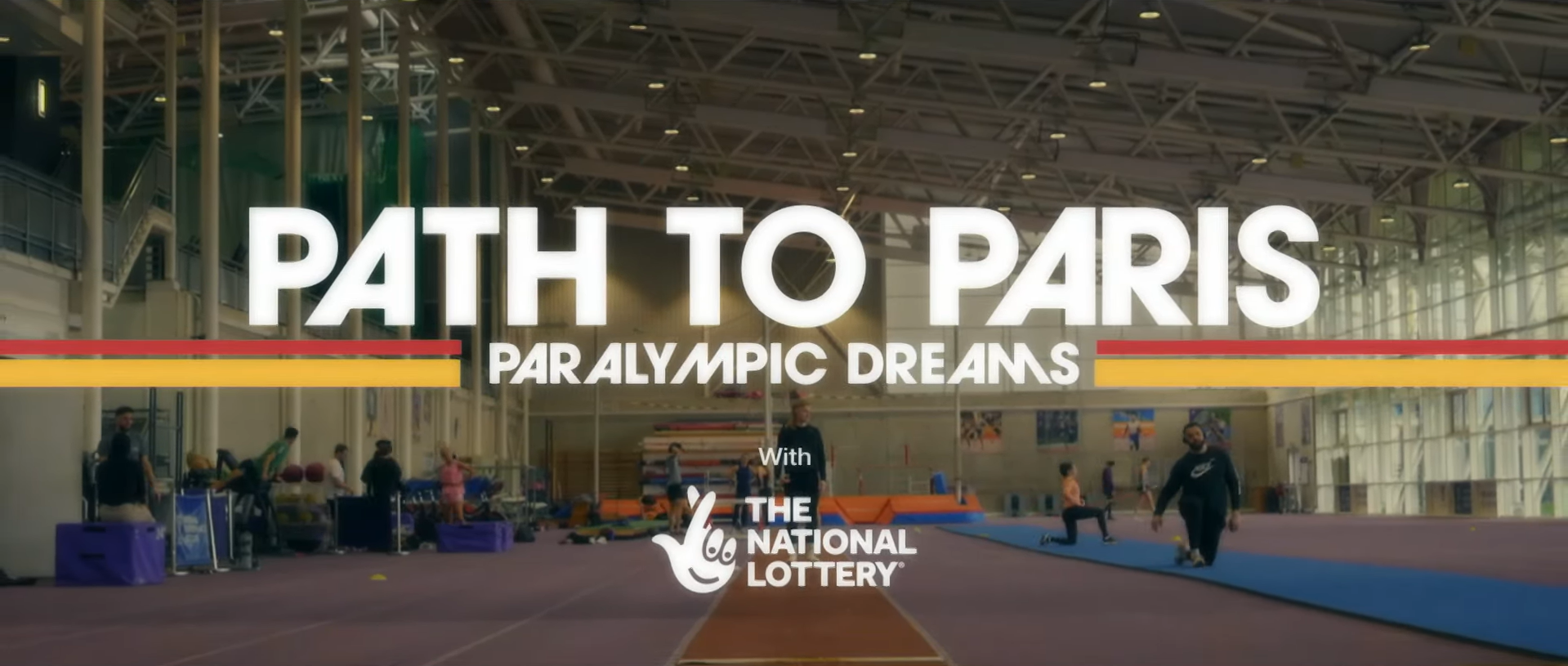


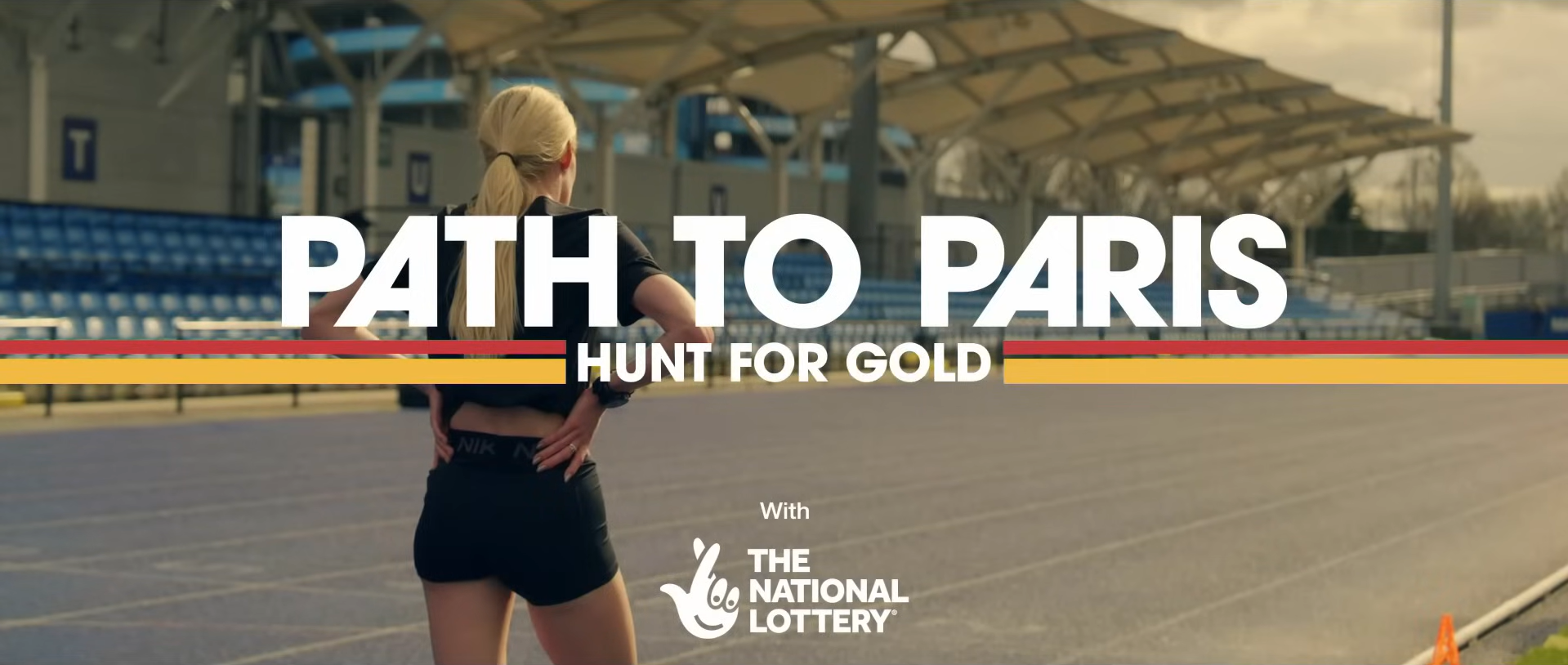
(Above) Collection of stills of the working title cards for the documentary series
(Below) A selection of boards from the ideation phase of the project, due to the time contraints of the project there was limited scope for wide exploration but we quickly honed in on the typeface, lines, and textures.
